If you’ve wondered how teams keep projects on track, the burndown chart might be the answer. Even if you don’t consider yourself technical, understanding a burndown chart can make working on projects feel less overwhelming and more rewarding.
What is a Burndown Chart?
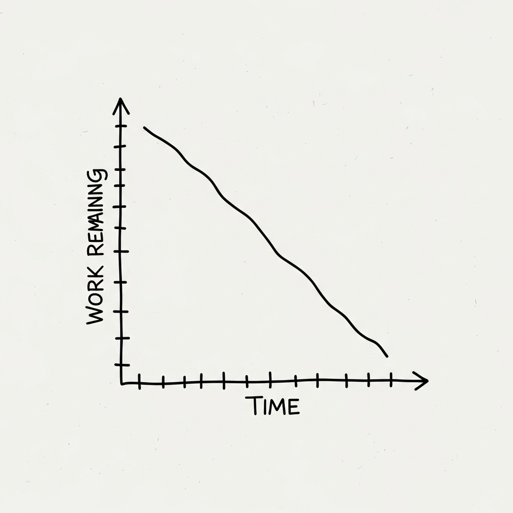
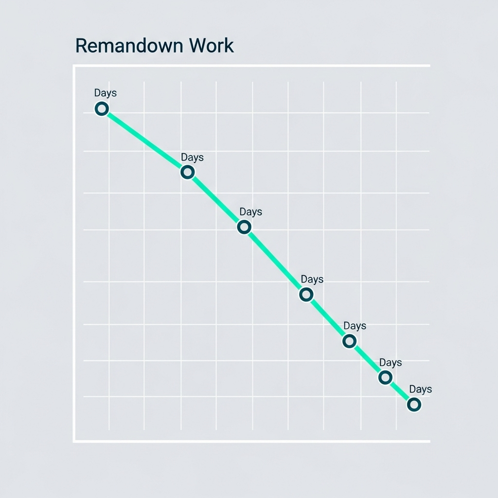
A burndown chart is a simple visual tool used to show how much work remains in a project and how quickly that work is being completed. Usually, it looks like a line graph that displays time along the bottom and work left to do on the side. The line ‘burns down’ as tasks are finished, giving everyone a quick look at progress.
Unlike complicated spreadsheets or detailed timelines, a burndown chart is straightforward. Because it’s easy to read at a glance, teams can spot when they’re on schedule—or falling behind.
How a Burndown Chart Works
The burndown chart starts with plotting the total amount of work you expect to complete. Each day, as tasks are finished, you update the chart with the new total of remaining work. Gradually, the line on the chart drops. If everything goes according to plan, the line reaches zero when the project ends.
Many teams use burndown charts in Agile project management, but anyone working towards a goal can benefit from this simple method.
Why Use a Burndown Chart in Everyday Projects?
You don’t have to be a software developer to use a burndown chart. For example, if you have a home renovation, an event to plan, or a team assignment in school, a burndown chart can help everyone see how much is left to do. This transparency reduces confusion and boosts confidence.
People often feel overwhelmed by big tasks. Breaking them into smaller steps and tracking them on a burndown chart makes progress clear—and small wins more visible. Plus, when things start to slip, you’ll notice it early, so you can adjust your approach.
Understanding the Basics of Burndown
Let’s keep it simple. The vertical axis of the chart shows work left (measured in hours, tasks, or points), and the horizontal axis shows time. Each day or week, you mark how much work remains. If you’re ahead, the line drops faster. If things take longer, you may see the line flatten out.
For those interested in more detail, you can visit Atlassian’s burndown chart explanation for visuals and tips, but the heart of the process is understanding what ‘done’ looks like and keeping your chart updated.
Benefits of Tracking Progress with a Burndown Chart
So, why bother with charts at all? There are some clear advantages:
- Clarity: You always know where you stand and how much is left to do.
- Motivation: Seeing the line go down feels satisfying and encourages everyone to keep going.
- Early Warning: It’s easy to spot slowdowns before they become bigger issues.
- Better Planning: Because everyone can see progress, your team can adjust plans as soon as problems arise.
- Simplicity: Anyone can understand a burndown chart, so you spend less time explaining and more time working.
Common Mistakes to Avoid When Using a Burndown Chart
Even simple tools have pitfalls. Here are some common mistakes to watch out for:
- Not updating the chart regularly. If you forget, your chart won’t reflect reality.
- Making tasks too big or vague. A burndown chart works best when tasks are clear and manageable.
- Ignoring the chart when things go wrong, instead of using it to adjust your plan.
- Using too much detail, which can make the chart confusing for everyone.
If you keep your chart up to date and focused on the essentials, you’ll get the most out of it.
Simple Ways to Start Using Burndown in Your Tasks
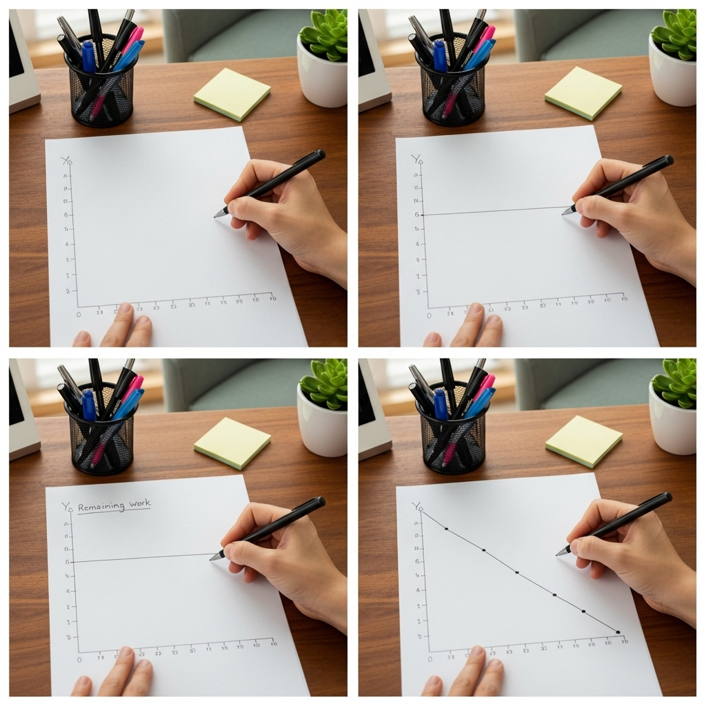
You don’t need fancy software to try burndown charts. Start by listing the tasks for your project, estimating how long each one might take. Next, draw a quick chart on paper or use a free online template.

Each day, cross out completed tasks and update your chart. Watch the line drop as you get closer to done. If you’re working with a team, hang the chart somewhere visible or share online, so everyone stays in sync. If you want to explore more tools, Blanmo can help you track progress easily and visually.
Burndown Chart Examples for Beginners
Let’s look at two simple examples:
1. Planning a Birthday Party:
You list five big tasks: sending invitations, booking a venue, ordering food, organizing games, and buying decorations. Each time a task is completed, you update your burndown chart. If you have a week to get everything done, the chart will show a line moving closer to zero each day.
2. Group School Assignment:
Your team divides the work into smaller sections—research, writing, editing, and creating visuals. The burndown chart tracks progress day by day. You’ll see whether your team is likely to finish early, on time, or if you need to work a bit faster.
Frequently Asked Questions About Burndown Charts
- Do I need special tools to make a burndown chart?
No, even a piece of paper works. But there are digital options if you prefer, like Excel, Google Sheets, or purpose-built apps. - How often should I update the chart?
Daily is best for most projects, but weekly works for longer timelines. - What if I finish tasks at different speeds?
The burndown chart will reflect this. If tasks are done faster, the line drops quickly; if they take longer, the line flattens out. It’s a tool to help you adapt. - Is it okay to use a burndown chart for personal goals?
Absolutely! It’s great for tracking any set of tasks, whether personal or professional.
In summary, understanding the burndown chart gives you a powerful yet simple way to track work, reduce stress, and build momentum. Taking the first step is easy, and with a tool like Blanmo, there’s even less effort between you and your goals.